Bayram Cigerli Blog

Bigger İnfo Center and Archive
  • Herşey Dahil Sadece 350 Tl'ye Web Site Sahibi Ol

    Hızlı ve kolay bir şekilde sende web site sahibi olmak istiyorsan tek yapman gereken sitenin aşağısında bulunan iletişim formu üzerinden gerekli bilgileri girmen. Hepsi bu kadar.

  • Web Siteye Reklam Ver

    Sende web sitemize reklam vermek veya ilan vermek istiyorsan. Tek yapman gereken sitenin en altında bulunan yere iletişim bilgilerini girmen yeterli olacaktır. Ekip arkadaşlarımız siziznle iletişime gececektir.

  • Web Sitemizin Yazarı Editörü OL

    Sende kalemine güveniyorsan web sitemizde bir şeyler paylaşmak yazmak istiyorsan siteinin en aşağısında bulunan iletişim formunu kullanarak bizimle iletişime gecebilirisni

1920s etiketine sahip kayıtlar gösteriliyor. Tüm kayıtları göster

1920's Bungalows

(Source)
Who doesn't love a cute house? For me the cutest and the ones that make me sigh the loudest are bungalows from the 1920's. Our town has a plethora of architectural styles from across the years and happily for me there was a major building boom in the 1920's. I love driving or walking the streets admiring all the houses.

(source)
The word "Bungalow" is somewhat generic. According to The Bungalow Book by Charles E. White published in 1923: "The term "bungalow" is a misnomer when applied to many American homes. To the average householder the term suggests a low, single-story dwelling with or without a second floor. In the minds of American it conjures up visions of a squatty building hugging hillside or meadow, with windows divided into little panes, verandas or porches extending along one or more sides and a low, overhanging room in the shelter of which trellises clime from the ground, covered with creeping vines. A pergola extends outwardly from a diminutive white doorway spanning a brick terrace or irregular shaped stone flagging; little children run gayly about in the garden picking bright flowers with which the sunny rooms are to be festooned. 
      In America, the word "bungalow" is hard-worked, vacillating, meaningless but it has become so firmly rooted in American mind that the term is now practically sanctioned by good usage.
A bungalow should be a home with all the charm and individuality of the approved house of two stories.
There is something cozy about a bungalow, inside as well as outside, and this most desirable quality makes an appeal to many who, having viewed with satisfaction the better class of bungalows feel a tug at their heartstrings and a desire to create the same type of building for their own home. At the same time an architectural effect on attainable with any other type of building is made possible in the bungalow. Who can forgo the charm of the low, broad roof line, the little front entrance with it quaint door opening so close to the ground, the low outlines of the little building which seems to nestle to snugly in its setting and offers so little competition with Nature as it rests modestly against the sky line, instead of rearing itself aggressively above the horizon.
The diminutive seems to appeal intensely to humans; the little bungalow attracts all eyes even the eyes of those who, with ample means to carry out their most cherished wishes, are yet attracted toward the sweet simplicity of the bungalow types, its freedom from pretense, and the artistic manner in which it fits the landscape.
The adaptation of the bungalow from Indian to American conditions has so changes its design that it is no longer recognizable, but the word "bungalow: has remained and will probably always exist as an architectural term applied to the low, single-story or story-and-half cottages with which we are familiar."
I am not sure if Charles E. White really clears up the question of what a bungalow actually is, but generally they have no more than one and a half stores, have broad eaves with a low pitched roof, generous front porches and ooze charm.

(Source)
Recently I realized just how much I love bungalows! Several houses have gone up for sale in the neighborhood and I just had to go to the open houses. The ohh and ahhing I did in the bungalows! Even though the non-bungalow I went through was an old small house, it didn't have quite as much charm.
Somehow, those 1920's architects managed to get everything just right. The living space feels spacious without being enormous, there are plenty of sunny windows and just enough quirks to make it charming. The minute I step through the door I feel right at home!
(Source)


(Source)
All of these floor plans have similarities to the floor plan of my little bungalow, but this one is the most similar.
I hope you have as much fun browsing these as I did! Do you have a favorite style of house that makes you want to cozy in?

A Little Bit of History

Before the year slips away completely, I want to show you the back door project. It is what kept me busy this fall. But before we get to the pretty pictures, I want to share a little history with you. 

In the process of installing the back door, all the exterior trim had to be removed and then put back on. And since it was off, I decided it was also a good time to strip off the aluminum wrapping that was hiding all the lovely details; scrape it down and re-painted it. 

I was very intrigued to notice there was a label on the backside of the trim and every piece was stamped with dimensions. This was very interesting as in the 1920's windows, doors and frames were typically custom built on-site by carpenters. 

A bit of research revealed the Anderson Frame Corporation. A lumber company founded in 1913 by Hans Andersen in Hudson, WI. By the 1920's Andersen Frame was selling pre-made window and door frames in standardized sizes. 

Andersen Frames invented the "two-bundle" system, where the vertical and horizontal frames were sold in separate bundles, thus they were able to provide standard sizes. It was nicknamed the 10-Minute Window as it could be assembled quickly and efficiently. 
(The entire Andersen catalog is view-able HERE)

Isn't that fascinating? The first company to sell pre-made building materials!
I love learning the history behind an everyday item!
Andersen Frames Corporation is still around today as Andersen Windows.

A Cheerful Print Frock- The Details

Are you ready to be a detective today? I am back as promised earlier this week with lots of details about this sweet dress. Once I started looking there are quite a few interesting things about it!

So let's start with the silhouette and overall shape of the dress. (This is one of the best ways to determine age of a garment.) This dress is very straight with short straight sleeves. When I tried the dress on (Yes, it fits me!), the sleeves; which look like normal short cap sleeves; suddenly looked like something out of a 1920's fashion illustration! Very straight and almost kimono looking.

There isn't any shaping in the back, it is one straight piece. The front has a waist seam and a drop waist seam. This is a very common detail for the 1928-1932 years as the waist made it's comeback.

The accented drop waist seam is also scalloped in dramatic points ending at inverted pleats. The only extra shaping or fabric is these pleats, no darts or pleats anywhere else. Not even shaped side seams!

I was very excited to see a tag, but alas, several google searches turned up nothing. I wonder if this was a small local factory or cottage industry?

The bodice front is also accent with red bias tape. I find the V ends that don't end in a point rather interesting. Was it shortened? Or intentionally made that way? The waist seam is another mystery. It is sewn with a serger, while all the other seams are french seams.

 Side seam sewn with a french seam. Very tidy! 
My guess is the dress was cut down to fit a smaller size. If the waist seam had been taken in, the side seams would also have to be taken in, so that doesn't make much sense.

A few repairs here and there made with red thread. 

 A tidy hand sewn hem, which was probably taken up (or down!).

All in all this cheery frock has quite the story to tell!
I know this post has a lot of pictures, but the dress captured my imagination and I got a bit carried away!

1920 National Defense Act, Tank Developments, and World War II (Why U.S. WW II tanks kind of sucked)


One of the unusual stories from the interwar period (1919 - 1941 for the United States) is the passing of the National Defense Act of 1920.  Sponsored by Julius Kahn this piece of legislation reorganized the United States Army and modified the rules on procurement and acquisitions, aiming to decentralize the process.  The National Defense Act of 1920, to my eye, has its greatest impact in how it influenced the development of tanks in the United States between World War I and World War II, due to a key technical requirement of the bill, that tanks were to be subordinated to the needs of the Army.  During World War I the United States had played with the idea of a separate Tanks Corps but after the war decided to focus in on tanks serving in an infantry support roll.


This, frankly, annoyed two leading United States military figures, Patton and Eisenhower, because it would strip tanks of their mobility potential and instead put them on the path of being rolling infantry support vehicles.  Congress however was firm on this point and also reduced the available budget for tank development to a bare minimum, forcing the army to pour its development dollars in the 1920s into vehicles like the one pictured above, the M2, a slow, under armed, mobile gun platform with an emphasis on machine guns to cut down advancing infantry over heavy cannons to destroy other tanks.


However Douglas MacArthur was made Chief of Staff of the United States Army and MacArthur wanted the United States Army to focus on being a faster, more mobile, and more nimble force.  He also wanted to develop tanks that focused on mobility and anti-tank capacity over lumbering along behind the infantry with a wad of machine guns.  But Congress had forbidden any development of tanks except by the Army, so what was a newly appointed general to do?


As it turns out, engage in some legal trickery.  The top image, and the one just above, are of respectively the T7 Combat Car and the M1 Combat Car.  Nearly identical to tanks they were developed by the United States Cavalry and use of development dollars was permitted because MacArthur told the Congress, with a straight face, that these weren't tanks.  No, these were "combat cars" - use they had armor, they had treads, and they had guns, but they were "cars" not tanks.  In fact the T7 Combat Car pictured at the top was built so it could be converted from treads to rubber tires, so it could flexibly roll along paved roads and then switch to an off-road tracked configuration.


This focus by Congress on cost-savings, and pinching military development funds during the interwar period, did help reduce the federal budget but it also led to the United States entering World War II with some, speaking frankly, really shitty tanks.  What you see above is the M3 Medium Tank, the Grant, which was obsolete at the start of the war and featured the terrible design flaw of many western tanks of the period, putting the heavy armament in a fixed side turret because fully rotating top turrets were hard to make work well.  The problem with this design is if your enemy happens to have a tank with a moving turret they have a better chance of lining up your non-cannon side for a kill shot.  (Note the awesome side mounted machine guns though.)


The United States did eventually hammer the issues out, with the design of the M4 Sherman, but it was made under pressure of war.  The United States also never really got into the business of real heavy tanks until World War II was nearly over, leading to some very lopsided tank engagements in 1944 through 1945 with the German army.

But I remain convinced it all hinges on the 1920 National Defense Act and how Congress shifted the focus of the United States military towards a fun-sized cost-saving military plan.

Sources:  Wikipedia articles on U.S. Tank Development History, the 1920 National Defense Act, the T7 Combat Car, the M1 Combat Car, and U.S. Army Military history journal entry on the Birth of the Armored Forces

Vintage Kitchen Inspiration

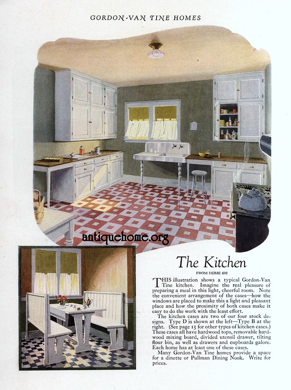
Gordon Van Tine::1926

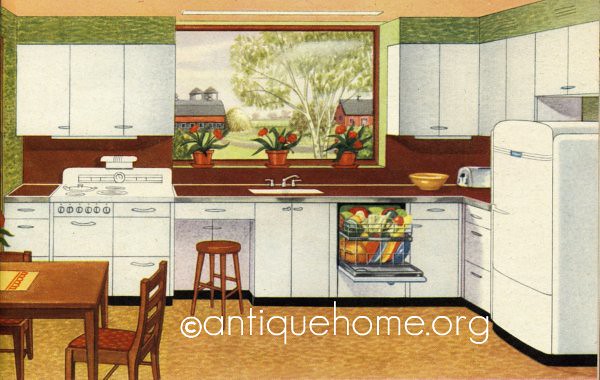
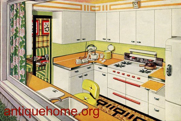
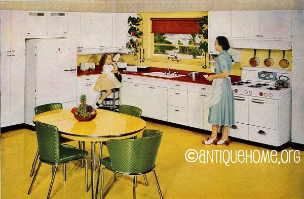
Here are a few vintage kitchens from Antique Home. I think I have mentioned this website before, they have a fabulous collection of house plans and interiors from the 1900-1960. One of my favorite place to go for inspiration! 
I loved seeing how kitchens changed over the years. From simple and functional in the 20's to colorful, modern and efficient in the 50's.  
1920's Modern Kitchen

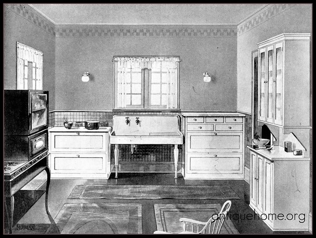
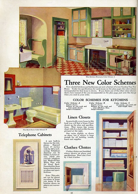
These two 1920's kitchens are mostly concerned with a functional and sanitary place to prepare meals. Not a lot of cupboard space, but massive sinks with hot and cold running water!

p18
This 1934 kitchen is a little warmer. Still not much cabinetry and did you notice the ice box by the back entry? Easily accessible for the iceman. I love the breakfast nook, a favorite in the 20's and 30's.

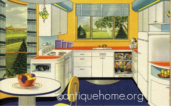
Hotpoint Kitchens - 1947
The 1940's brought big changes to kitchens, lots of new materials like Formica and plastics. Color everywhere and modern appliances like the dishwasher!

1947 Farm Kitchen
I love how so many kitchens included places at the counter where you could pull up a stool and work. Something that would be nice in today's kitchens.

1950 Kitchen - Golden Glow - Kitchen Design
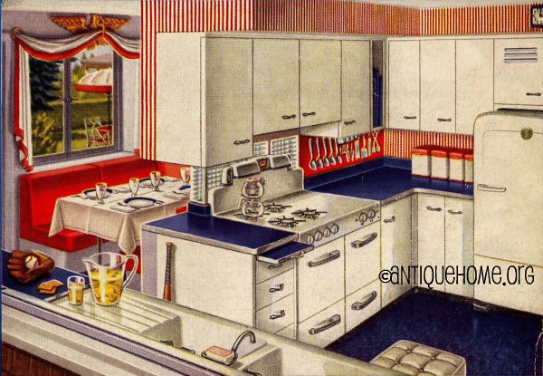
For the 1950's it was more of the same, more bright bold colors, efficient features like pull-out cutting boards, drying racks and a more compact work triangle.


Red, White, and Blue 1950's Kitchen Design
This one was one of my favorites! 

1950 Kitchen Design
I hope you enjoyed this inspiration, visit Antique Home for more!

1910 and 1920 Apron Inspiration

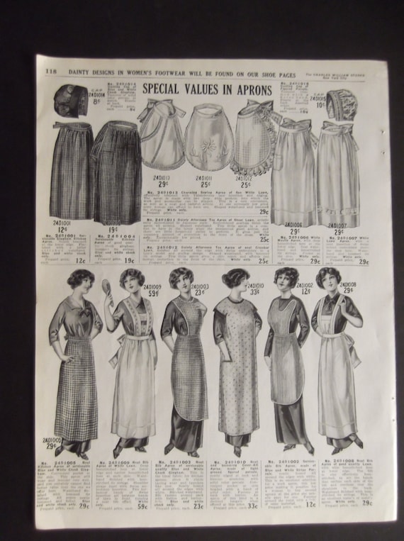
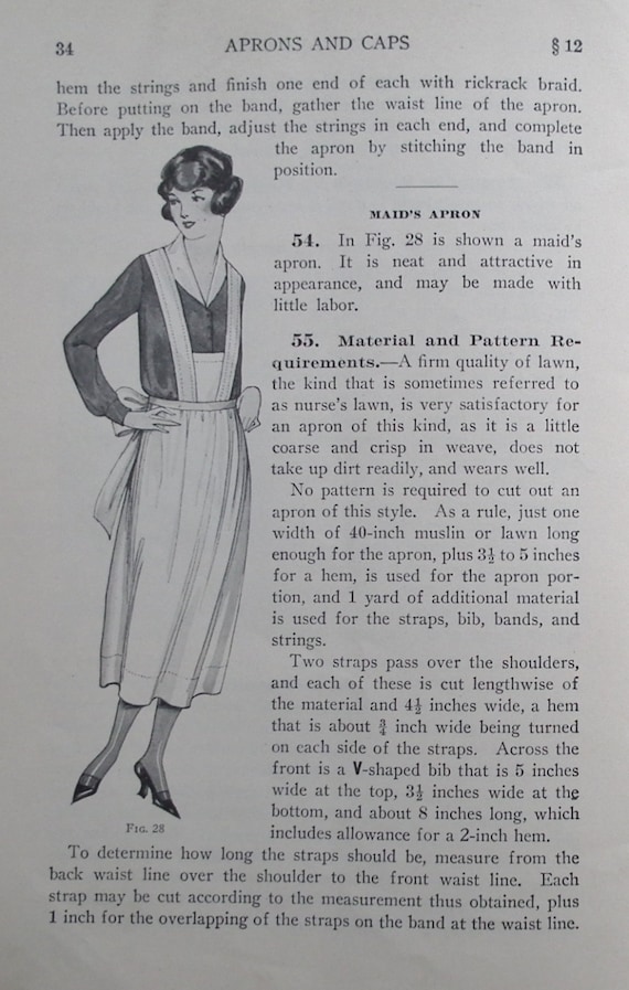
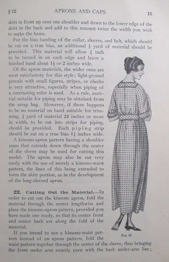
I found these lovely 1914 and 1922 apron images while browsing Etsy.
Aren't they lovely! From a 1914 catalog. See Vintage Ad Gallery for more details.


These three are from a Women's Institute of Art and Science booklet on Aprons and Caps for sale by Sew Much Frippery

Mrs. Pinkham's Vegetable Tonic


Have you ever heard of Lydia Pinkham's Vegetable compound? It was one of the first "medicines" marketed just for women. There is a very interesting history of the company here. They were a very prolific company publishing quite a few booklets on a variety of subjects.
This one is a cooking booklet. Published around 1929.
 The testimonials are quite something with their dramatic wording. But as usual for cookbooks of this era, you can spot several very cute aprons!

 "Wholesome Candies" ?!? 

 This one is on Sewing. Love the cover! It is also the same time frame 1928.

 Directions for an apron, which I made and posted about here.

 A simple negligee......
 a Nightgown.....

I love this illustration of  a "modern working girl"!